Chapter 3 of 10
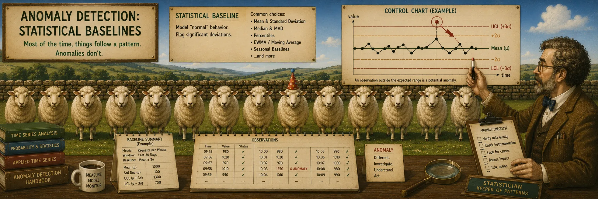
Anomaly Detection: Statistical Baselines
Created Apr 28, 2026 Updated May 3, 2026
Anomaly detection is the task of identifying points that differ "too strongly" from the normal behavior of a series. The formal definition of an anomaly depends on the context and on what we consider "normal": for some tasks an anomaly is a sharp spike, for others — a smooth drift of the mean, and for still others — a violation of a periodic pattern.
The sections below cover the basic statistical methods of anomaly detection on time series — Z-Score, IQR, Moving Average — and two ways to ensemble them (voting and weighted scoring). At the end are quality metrics for anomaly classification, common to any of these techniques and to more sophisticated ML approaches.
Types of anomalies
Before talking about specific methods it is useful to fix what kind of anomaly each method is actually good at finding. The standard classification distinguishes three types, and the choice of detector should follow from which of them you care about.
A point anomaly is a single observation that is unusual relative to the rest of the series — a spike or a drop that stands out on its own. Most of the simple statistical detectors discussed below (Z-Score, IQR, simple moving-average residuals) are designed almost entirely for this case.
A contextual anomaly is a point that is only unusual given its context. A hundred orders per minute may be perfectly normal at 11:00 on a Monday and very strange at 03:00 on a Sunday — the absolute value is the same, the meaning is different. Detecting contextual anomalies requires a notion of "normal for this moment", which usually means modeling time-of-day, day-of-week, or other seasonal effects rather than running detectors on the raw signal.
A collective anomaly is a sequence of points that is unusual taken as a whole, even though each individual point looks acceptable in isolation. A flat line on a metric that is supposed to fluctuate, or a slow gradual drift away from a baseline, is a typical example. Point-based statistical detectors will usually miss these; catching them requires looking at windows, residuals against a model, or change-point methods.
The Z-Score, IQR and moving-average detectors below are mainly point-anomaly tools. They handle some contextual anomalies once they are made rolling (so that "normal" is local rather than global), but collective anomalies are largely outside what they can see, and need either explicit decomposition (trend / seasonality / residual) or methods designed for change points and sequences.
The three categories side by side, each on its own short series. Point anomaly stands out in absolute terms — easy for global Z-score and IQR. Contextual is normal globally but wrong for the moment (a flat reading right at a seasonal peak) — needs a baseline of “normal for this part of the cycle”. Collective has no single odd point — the problem is that the sequence stays flat where it should oscillate, and only window-level or change-point methods see it. Useful as a quick reference when reading further sections about which detector is good at which kind.
Z-Score (statistical method)
Z-Score is the simplest statistical method of anomaly detection, based on the classical measure of standardization: "how many standard deviations a value differs from the mean."
Formula:
z = (x - μ) / σInterpretation: by how many standard deviations the value deviates from the mean.
The geometric meaning of Z-Score is very simple. If you have a distribution with center μ and spread σ, then the value x is converted into a "number of steps" from the center, where one step equals one σ. A z-score equal to zero means that x is exactly equal to the mean. A z-score equal to two means that x is two standard deviations away from the mean. The sign of z itself shows the direction: positive — above the mean, negative — below.
Distribution of Z-Score for normal data
The Z-Score formula itself can be computed for any numeric distribution — there is nothing in (x − μ) / σ that requires Gaussian shape. The normality assumption enters only when we try to interpret a particular threshold probabilistically. The well-known thresholds come from the three-sigma rule:
|z| < 1— 68% of the data.|z| < 2— 95% of the data.|z| < 3— 99.7% of the data ("three sigma rule").
The threshold |z| > 3 is a common convention. Under a normal distribution, roughly 0.3% of observations are expected to fall outside this range — so under the same assumption, that is the fraction of points the rule would flag as anomalies.
This rule tells us that beyond the interval [μ − 3σ, μ + 3σ] lies only 0.3% of observations if the data are truly normal. That is why the classical convention is to treat all points with |z| > 3 as anomalies. For less strict applications a threshold of 2 is used (catching ~5% of the data as potential anomalies); for stricter ones — 4 or higher. Choosing the threshold is always a trade-off between recall (how many real anomalies we catch) and precision (how many false alarms we are willing to tolerate). The crucial point is that the meaning of a chosen threshold — "0.3% of the data" or "5% of the data" — is only valid when the underlying distribution is close to normal.
Limitation of the normality assumption
In practice many real distributions have heavy tails: financial returns, response times, sensor readings with rare bursts. On such data the three-sigma threshold misbehaves in two distinct ways, and it is worth keeping them separate in your head.
The first effect is too many false positives. On a heavy-tailed distribution, a value four or five standard deviations from the mean is not a once-in-a-million event — it is a normal part of the tail behavior. Treating every such point as an anomaly produces a flood of alerts on observations that are, in their own distribution, perfectly ordinary.
The second effect is the opposite: missed anomalies. Extreme values that do sit in the dataset inflate the estimated mean and standard deviation, and that bigger σ then makes subsequent extreme values look less unusual than they really are. The detector ends up partially calibrated against the very anomalies it is trying to catch — a kind of self-masking.
Both effects come from the same root: the empirical mean and standard deviation are not robust to outliers. The IQR-based and median-based methods below are the standard responses to this, by leaning on quantiles and the median instead.
Rolling Z-Score for time series
For time series, pure Z-Score with static μ and σ works poorly because real signals have trend and seasonality. Imagine temperature: in summer the average is 25°C, in winter −10°C, the global yearly average is 8°C. If we detect anomalies by global μ and σ, then all summer days will be "anomalously hot," and all winter ones — "anomalously cold."
Rolling Z-Score solves this problem: μ and σ are computed over a sliding window of the last W points before the current one, and the value is compared with that recent local context.
μ_{t-1} = mean(x_{t-W}, ..., x_{t-1})   # rolling mean over the W points before t
σ_{t-1} = std(x_{t-W}, ..., x_{t-1})
z_t = (x_t - μ_{t-1}) / σ_{t-1}         # compare with the past context only
It matters that the current point is not included in the window used to evaluate it. If x_t were part of its own window, a large anomaly would partially hide itself by shifting the local mean upward and inflating the local standard deviation — the same self-masking effect described in the previous section, just operating one window at a time. Excluding the current point from its own baseline is one of those small disciplines that pays off forever.
This way we capture exactly the deviations from the current regime, rather than from the global one.
Adaptiveness to drift
If the signal changes smoothly (seasonality, trend), rolling Z-Score automatically adjusts — a static global μ, σ would label every value at the seasonal peak as an anomaly, while the rolling version naturally "drifts" along with the signal.
Limitations
Rolling Z-Score has two characteristic limitations.
The first concerns sudden level shifts. When the signal abruptly jumps to a new regime, a rolling detector will typically alert during the transition — the first few points after the shift land far from the still-old baseline and look anomalous. Then, as the window fills with values from the new regime, the rolling mean and std shift along, and the detector silently accepts the new level as normal. This is fine for "spike" detection but means that rolling Z-Score is not, by itself, a reliable change-point detector: it tends to alert on the edge of the change and then go quiet, even if the entire new regime is operationally suspicious. Tasks of that kind — explicitly detecting that the underlying distribution has shifted — call for dedicated tools such as CUSUM, Page–Hinkley, Bayesian online change-point detection, or monitoring residuals against an expected baseline.
The second is division by zero on a constant signal. If all values in the window are identical, σ = 0 and the z-score formula is undefined. The right behavior here is not "always return 0" — that would silently miss obvious anomalies. The honest rule is to handle the case by hand: if the current value sits at (or extremely close to) the constant baseline, the point is normal; if it differs from that flat baseline by more than a small tolerance, it is by construction anomalous, and should be flagged as such (or at least surfaced as suspicious for review). Treating every σ = 0 window as automatically "no anomaly" is a common shortcut and a common bug.
A 200-point sinusoidal series with five planted anomalies, all of the same magnitude (|δ| = 12) — four sit near troughs or peaks of the cycle, the central one (t = 100) sits mid-cycle. Switch between Global and Rolling, slide the threshold and (for rolling) the window. The point of the widget is that no single setting catches all five without false alarms. At threshold 3 Rolling cleanly catches the four well-positioned spikes — but the central one stays hidden, because its lookback window covers most of the seasonal swing and the local std is too large for the same δ to cross |z| = 3. Lower the threshold to catch it and a flood of false positives appears at the seasonal peaks. That is the precision/recall trade-off made physical: you pick which mistake hurts less, you do not get to avoid both. When the structural ceiling of fixed-window Z-score becomes the bottleneck, the seasonal-baseline detector further down the page is the next move.
Robust Z-Score (median and MAD)
A natural intermediate between the Z-Score above and the quantile-based IQR method below is to keep the form of the z-score but replace the non-robust mean and standard deviation with their robust counterparts: the median and the Median Absolute Deviation (MAD).
Formula:
MAD = median(|x_i − median(x)|)
robust_z = 0.6745 × (x − median(x)) / MAD
The MAD is exactly what its name suggests — the median of the absolute deviations of each observation from the overall median. It is a robust measure of spread in the same sense as the median is a robust measure of location: a few extreme values barely move it. The factor 0.6745 is a normalization constant that makes the robust z-score numerically comparable to the ordinary z-score on Gaussian data: for normally distributed data, 1.4826 × MAD is a consistent estimator of σ, and 0.6745 = 1 / 1.4826 is the reciprocal scaling factor that appears when the robust z-score is written directly. With this calibration the threshold |robust_z| > 3 keeps roughly the same intuitive meaning as in the classical case, while the underlying estimator is no longer sabotaged by the very outliers it is trying to find. (Strictly speaking, the constant 1.4826 gives consistency under normality, not unbiasedness in finite samples — for very small windows there is a small-sample correction in the literature, but for the typical anomaly-detection window sizes the plain constant is what people use.)
This is often the cheapest single upgrade you can make to a Z-Score-based pipeline: same formula, same thresholds, same code structure, but a detector that does not quietly inflate its own σ when an outlier walks past.
The same boundary case as for ordinary Z-Score appears here too: on a constant or nearly constant signal, MAD itself is zero, and the formula is again undefined. The right reaction is the same in spirit and needs to be explicit in the code: if the current value matches the median within tolerance, the point is normal; if it differs materially from a flat median baseline, it is by construction suspicious and should be surfaced. Blindly dividing by MAD, or quietly replacing a zero MAD with a tiny epsilon, produces unstable scores that swing wildly on what is really a degenerate distribution — exactly the kind of "looks fine in the formula, misbehaves in production" failure that the robust version was supposed to prevent.
80 normal observations from N(50, 4) with one movable outlier. The slider drags the outlier through the data; the histogram shows where it lands and two pairs of vertical lines mark the classical ±3σ thresholds and the robust ±3·1.4826·MAD thresholds. As the outlier walks rightward, the classical mean and σ inflate visibly and the outlier’s own |z| stays under 3 — the self-masking the section calls out — while the median and MAD barely move and the robust |z| keeps climbing.
IQR (Interquartile Range)
IQR is an anomaly-detection method based on quantiles of the distribution rather than on the mean and standard deviation. This makes it much more robust to extreme values and skewed distributions than Z-Score.
Quantiles and IQR
- Q1 — 25th percentile (25% of the data is below).
- Q2 — median (50%).
- Q3 — 75th percentile.
IQR = Q3 − Q1 — the interval containing the middle 50% of the data.
To understand IQR, recall the definition of a quantile. For an ordered dataset, the k-th percentile is the value below which k% of the observations lie. The median (50th percentile) splits the data in half: half is below, half is above. Q1 cuts off the lower quarter, Q3 — the upper one. The Interquartile Range is the distance between Q1 and Q3, that is, the spread of the "central half" of the data.
Anything too far from this central zone is considered suspicious.
Tukey fences (1977)
- Inner fences:
[Q1 − 1.5 × IQR, Q3 + 1.5 × IQR]— "mild outliers". - Outer fences:
[Q1 − 3 × IQR, Q3 + 3 × IQR]— "extreme outliers".
John Tukey in 1977 formalized the idea by introducing the concept of "fences" — boundaries of the normal range. Inner fences cut off "moderate" outliers — anything that goes beyond Q1 − 1.5 × IQR from below or Q3 + 1.5 × IQR from above. Outer fences with a coefficient of 3 cut off "extreme" outliers.
Why exactly 1.5? For a normal distribution IQR ≈ 1.349σ, with Q1 ≈ −0.674σ and Q3 ≈ 0.674σ. The inner Tukey fences Q1 − 1.5 × IQR and Q3 + 1.5 × IQR therefore land at roughly ±2.7σ from the mean — close to, but not identical to, the three-sigma rule. On normal data Tukey fences give a result similar to Z-Score, but with one critical difference — they do not depend on extreme values in the sample.
Why IQR is better than Z-Score on skewed data
- Z-Score assumes a symmetric distribution around the mean.
- IQR uses robust statistics — quantiles do not depend on extreme values.
- For distributions with heavy tails (log-normal, power law), IQR is more robust.
Robustness is the main advantage of IQR. In statistics there is the notion of robust statistics: methods whose result does not change much in the presence of outliers. Quantiles are a robust statistic by construction: if you add one huge value to the array, the median will hardly shift. The mean, however, will shift strongly — it "feels" each value in proportion to its magnitude.
For strongly skewed distributions, however, the symmetric ±1.5 × IQR fences are still only an approximation. A right-skewed distribution will naturally have a longer upper tail than lower tail, so a single symmetric fence either flags too many points on the upper side or too few — the right-hand fence really should sit further from Q3 than the left-hand fence sits from Q1. In production, the usual responses are to use separate lower and upper thresholds (chosen from the empirical distribution rather than from a single 1.5 × IQR rule), or to transform the data into a more symmetric shape first — a log transform is the standard tool for log-normal-like quantities such as response times, prices, or counts that span several orders of magnitude.
A concrete example of the difference
Take an array of nine numbers: [1, 2, 2, 3, 3, 3, 4, 4, 100]. Eight values lie in the range 1–4, while the ninth (100) is an obvious anomaly.
Z-Score fails. The extreme value 100 itself pulls the mean (up to 13.6) and std (up to 32.3) so strongly that its own z-score comes out around 2.7 — not enough for the classical threshold of 3. The method literally "forgives" the outlier, because the outlier itself distorts the norms by which it is measured.
IQR works correctly. The median and quantiles barely feel the value 100 at all: Q1 = 2, Q3 = 4, IQR = 2, upper fence = 4 + 1.5 × 2 = 7, and the value 100 is clearly beyond the boundary. This is exactly robust behavior. (The exact numerical values of Q1 and Q3 may shift slightly depending on the quantile convention used by a particular library — NumPy, pandas, scipy and R each support several interpolation methods — but the conclusion is the same: the upper fence ends up well below 100, and the outlier is correctly flagged.)
500 samples from one of three distributions — normal, log-normal, Student-t (heavy-tail). Quartiles and Tukey fences are drawn on the histogram; the multiplier k is a slider. On normal data the symmetric ±k·IQR fences land near ±2.7σ and behave like Z-score. On log-normal the same symmetric rule flags dozens of right-tail points and zero on the left — the asymmetry that motivates a log transform or independently chosen lower/upper thresholds.
Moving Average (MA)
Moving Average is best thought of not as a separate anomaly-detection principle, but as a way to define a local baseline. Once that baseline is in place, anomalies are detected exactly as before — by looking at how far the current point sits from it, scaled by the local variability. The contribution of the moving average is the baseline itself, not the detection rule on top.
The idea of the baseline is simple: track the rolling mean of the signal and treat it as the "local normal" level, then flag as anomalous those points that deviate too strongly from it.
Simple Moving Average
It is worth distinguishing two roles SMA plays in time-series work, because they use slightly different windows and the distinction matters in practice.
As a smoother, the Simple Moving Average is just the arithmetic mean of the last W points, including the current one:
SMA_t = mean(x_{t-W+1}, ..., x_t)At each step the window slides forward: drop the oldest point, add a new one, recompute the mean. This is the version used to draw smoothed lines on charts, attenuate high-frequency noise, or extract a slow trend component.
As an anomaly baseline, the window must instead exclude the current point — otherwise the point we are evaluating partially defines its own baseline and quietly hides itself, exactly as in the rolling Z-Score case discussed earlier:
baseline_t = mean(x_{t-W}, ..., x_{t-1})
std_t      = std(x_{t-W}, ..., x_{t-1})
score_t    = (x_t − baseline_t) / std_t
The ratio of the deviation to the local standard deviation gives us a z-score-like statistic, scaled by how variable the signal has recently been. Numerically this is just rolling Z-Score under a different name, and the next subsection makes that explicit; the value of writing it in moving-average notation is that the baseline baseline_t becomes a first-class object, which generalizes cleanly to weighted, exponential, or seasonal baselines without changing the detection rule.
Relation to rolling Z-Score
In the simple form above the Moving Average detector and Rolling Z-Score are essentially the same family of method: both compare the current value with a local rolling baseline and scale the deviation by the local variability. If MA_{t-1} is just a rolling mean and σ_{t-1}^MA is the rolling standard deviation over the same window, then (x_t − MA_{t-1}) / σ_{t-1}^MA is, formula for formula, a rolling z-score. The difference is mostly one of framing rather than mechanics: the moving-average framing emphasizes baseline smoothing (what is the current "expected" level?), while the z-score framing emphasizes the standardized deviation (how surprising is the current point?).
For sustained level shifts neither variant is, in itself, a change-point detector — both adapt as soon as the window or smoothing fills with values from the new regime. If "the shift that does not return" is the actual question you care about, the right tools are CUSUM, EWMA control charts, or a dedicated change-point method, not a slightly retuned rolling baseline.
Exponential Moving Average (EMA)
Formula:
EMA_t = α × x_t + (1 - α) × EMA_{t-1}Exponential Moving Average is an elegant development of the rolling-mean idea with several practical advantages:
- No need to store the window — O(1) memory (unlike SMA, which keeps the entire buffer of size W).
- Recent points have greater weight — more responsive to fresh changes.
- α ∈ (0, 1) — the smoothing parameter. A common rough equivalence is
span ≈ 2/α − 1, soα = 0.1corresponds to a span of about 19 points.
Instead of storing a window of the last W points, EMA recursively updates a single value: the new EMA is a weighted sum of the current observation and the previous EMA. The parameter α controls how strongly EMA reacts to new data: the closer to 1, the greater the weight of fresh observations.
EMA is more memory-efficient and more responsive to recent changes than SMA, and it does not need a full window of W points before producing a value. It does, however, have its own startup issue: the first few EMA values depend strongly on how EMA_0 is initialized. If you initialize with zero on a non-zero series, the smoothed line spends a while crawling up to the actual level; if you initialize with the first observation, you implicitly weight that single point very heavily. The standard fixes are a short warm-up period during which alerts are suppressed, a bias-correction term (the formulation used in Adam and similar optimizers), or initialization from the mean of the first few observations rather than from a single value. These are small details, but they are the difference between EMA being "instantly correct" and EMA visibly misbehaving for the first dozen points.
EMA is popular in finance (EMA of price lines), service monitoring (smoothed latency percentiles), and anomaly detection on long-running streams precisely because of this combination of low memory cost and fast adaptation — once the startup transient is past.
200-point series with four planted anomalies. EMA is the local baseline, the shaded band is ±k·σ around it, and points outside the band are flagged. Sliders control α (and equivalently the SMA window W ≈ 2/α − 1, overlaid as a dashed line — the equivalence is visible at α = 0.1) and the threshold multiplier k. Push α high and the band hugs the noise so neighbours of every spike start firing as false alarms; pull α low and the band lags so post-spike recoveries get flagged instead. Toggle Cold start at small α to see the band crawl in from zero at the start.
Seasonal anomalies
All of the detectors above — global Z-Score, rolling Z-Score, IQR, MA, EMA — share an implicit assumption: that "normal" is well described by the recent local distribution of the signal. For series with a strong seasonal pattern this assumption breaks in a particular way that is worth treating separately.
Consider a daily metric where the natural rhythm of the system already produces large swings: web traffic that triples between 03:00 and 21:00, retail sales that always peak on Saturday, an industrial sensor that follows the workday schedule. Run a rolling Z-Score over the raw values and you will get exactly the wrong answer. Either the window is short enough to track within-day variation, in which case nothing ever looks anomalous because the baseline is constantly chasing the seasonal cycle; or the window is long enough to cover multiple cycles, in which case every peak and every trough comes out flagged as "unusually high" or "unusually low" relative to the rolling mean. Both failure modes are signs that the detector has been pointed at the wrong quantity.
The standard fix is to detect anomalies against the expected seasonal baseline rather than against the raw signal. The simplest version of this idea does not require any decomposition at all: compare the current point with values from the same seasonal position — the same hour yesterday, the same hour on the same weekday last week, or the same weekday averaged over the last several weeks. The "baseline" is then literally those past comparable observations, and the detector runs on the difference. For many monitoring tasks this is enough: web traffic at 09:00 on Tuesday is judged against 09:00 on previous Tuesdays, and a Sunday-night spike no longer hides inside the wide range of weekday daytime values.
A more elaborate approach is to decompose the series into trend, seasonality, and residual components, and then run any of the detectors above on the residual. The trend captures slow drift, the seasonal component captures the regular within-week or within-day pattern, and the residual is what is left after both have been subtracted — the "surprise" relative to what we already expected. Methods such as STL decomposition (Seasonal-Trend decomposition using Loess) are the standard choice for this preprocessing step. A traffic spike that is unsurprising at 09:00 on Monday and very surprising at 03:00 on Sunday produces, under this approach, a small residual in the first case and a large one in the second — and a downstream Z-Score or IQR detector will reflect that.
The "same hour last week" baseline and the decomposition baseline are not really competitors — they are two points on the same spectrum. The first is cheaper, easier to explain to a non-statistician, and surprisingly hard to beat for short, well-understood seasonal patterns. The second handles overlapping seasonalities (weekly and yearly), gradual trend, and noisier residuals more cleanly, at the price of an extra modeling step.
Three weeks of hourly data with strong daily and weekly seasonality. Two anomalies live in the last week: a tall spike on top of a normal afternoon peak (high in absolute terms but contextually unsurprising) and a moderate bump in the middle of the night (small in absolute terms but very strange at that hour). Switch the baseline between rolling Z on the raw signal and same-hour-last-week. Rolling Z either misses the night spike or floods the daytime peaks with false alarms; the seasonal baseline catches both real anomalies cleanly with the threshold left at 3.
Hybrid (Voting Ensemble)
Hybrid is the first of two ensemble approaches. The idea is very simple, in the spirit of voting in elections: we run several independent detectors on a single point and flag it as an anomaly only if at least a certain number of algorithms agreed. Each detector outputs a binary vote (yes/no), the votes are summed and compared against a threshold.
Idea and formula
Idea: run independent detectors, vote by majority.
is_anomaly(x) = 1 if (Z_Score_vote + IQR_vote + MA_vote) ≥ Nwhere N is the threshold (for example, 2 out of 3).
With three detectors, a threshold of N = 2 means the classical majority rule: at least two out of three must agree. One can make it stricter (N = 3 — unanimous) or more liberal (N = 1 — one signal is enough), and the choice reflects a compromise: stricter — fewer false positives, but more misses; more liberal — the opposite.
Mathematical justification
The mathematical attraction of voting ensembles rests on the assumption that the errors of different detectors are statistically independent. The exact gain, however, depends on the voting threshold, and it is easy to overstate it by quoting the wrong formula.
Suppose each of three detectors has a false-positive rate p, and that their errors really are independent. Then for unanimity voting (all three must fire), the combined false-positive probability is
P(FP | unanimity) = p³For majority voting (at least two out of three must fire), the calculation also has to count the cases where exactly two err and the third does not, which gives
P(FP | majority of 3) = 3 · p² · (1 − p) + p³With p = 0.05 these two regimes give very different numbers. Unanimity yields 0.05³ ≈ 0.000125 — about 400 times smaller than a single detector. Majority voting yields 3 · 0.05² · 0.95 + 0.05³ ≈ 0.00725 — only about an order of magnitude smaller, not three. Both are improvements over a single detector, but the "free 400×" intuition really only applies to the strict unanimous case. The more common majority rule is correspondingly more modest.
This is why it is worth being explicit about which threshold the ensemble actually uses when claiming a particular FP-rate improvement, rather than quoting pᴺ as if it were a property of ensembling in general.
Independence assumption — a practical limitation
The key assumption of this analysis is that the errors are truly independent. In practice they are often correlated: all algorithms look at the same signal, and so they often err simultaneously on the same data peculiarities.
If the data have a pronounced pattern on which all three methods get confused (for example, a smooth seasonal drift), they will err together. The real FP rate of the ensemble is always worse than the product of individual FP rates, sometimes much worse. This does not negate the usefulness of ensembles, but it is important to understand that the guarantee is not strict but heuristic.
Trade-off with recall
The flip side of ensembling is a reduction in recall, that is, the ability to catch real anomalies. Imagine some subtle anomaly is visible to only one of the three detectors — for example, IQR saw it, but Z-Score and MA missed it. Under the majority requirement, such a point will not make it into the final result, even though it was a real problem.
The stricter you make the voting, the more FP you cut off, but the more TP you lose. Choosing the threshold is always a balance between "we care about not missing" and "we care about not being noisy."
Ensemble (Weighted Scoring)
Ensemble is a more flexible variant of ensembling compared to Hybrid voting. Instead of binary "anomaly / not anomaly" votes, each detector outputs a continuous score from 0 to 1, reflecting its confidence. The final decision is made not by counting votes, but by a weighted sum of these scores.
Idea
score = w1 * norm_zscore(x) + w2 * norm_iqr(x) + w3 * norm_ma(x)
is_anomaly = score > threshold
The critical difference from voting is the preservation of information about the degree of confidence. A z-score equal to 3.1 and a z-score equal to 15 at threshold 3 would both produce the same binary "anomaly" vote, even though 15 is a much stronger signal. In weighted scoring these two cases turn into different scores (for example, 0.55 and 0.99), and the ensemble can use this difference.
The weights w1, w2, w3 reflect the relative confidence in each detector: if we know that IQR is more reliable than Z-Score on our data, we give it greater weight.
Normalizing the scores
For the scores from different algorithms to be comparable, normalization is needed. The shape of normalization that makes the most sense is one where a "nothing happening" input produces a score near zero, the chosen anomaly threshold sits at 0.5, and clearly anomalous inputs push the score toward 1.
For a z-score the natural choice is therefore a shifted sigmoid centered on the chosen threshold. The general form is
score_z = 1 / (1 + exp(−(|z| − threshold) / τ))so that with threshold = 3 (the three-sigma convention) and a temperature τ controlling how sharply the score transitions:
|z| < 3→ score below 0.5 ("less suspicious than the threshold");|z| = 3→ score = 0.5 ("right at the boundary");|z| > 3→ score above 0.5 ("more suspicious than the threshold").
The naive 1 / (1 + exp(−|z| / 3)) without the shift gives 0.5 at |z| = 0, which is the wrong end of the scale: a point that perfectly matches the local mean would already look half-anomalous before any deviation is observed. The shifted form fixes that.
For IQR it helps to separate two different quantities that are easy to confuse. The first is a raw distance score — how far past the fence the point sits, in units of IQR itself:
raw_iqr = max(0, distance beyond the fence / IQR)This raw score is zero when the point lies exactly on the fence (or anywhere inside it) and grows as the point moves outward. The second is a 0–1 confidence score in the same sense as the shifted-sigmoid z-score above — a value where 0.5 corresponds to "right at the chosen anomaly threshold" and values above 0.5 mean "more confident than the threshold". To get from one to the other, the raw distance is passed through a shifted sigmoid (or calibrated against a validation set), exactly as for the z-score, with the boundary placed wherever you want the 0.5 mark to sit.
Mixing these two quantities in a weighted sum without putting them on the same scale is one of the standard pitfalls of this kind of code — the raw IQR distance can easily dominate or be dominated by a sigmoid z-score depending on the chosen units, even when the two detectors are equally informative. For MA-based detectors a sigmoid identical in shape to the z-score one works in the same way, and should be calibrated to the same convention.
When weighted scoring beats voting
The main advantage of weighted scoring over voting shows up in borderline cases. Imagine a point that is weakly suspicious by all three criteria: Z-Score gives a score of 0.4, IQR — 0.4, MA — 0.4.
In a voting ensemble, all three detectors would say "no, not an anomaly" (assuming a per-detector threshold of 0.5 for a "yes" vote), and the point would be skipped entirely. In weighted scoring, those three weak suspicions can accumulate into a stronger combined signal — the intuition that "if three independent detectors all weakly suspect the same point, our overall confidence should go up" is exactly right.
Where the example needs care is in the arithmetic, because it depends on whether the weights are normalized. If the weights are not normalized and the threshold is defined on the raw weighted sum (for example with w1 = w2 = w3 = 1 and a threshold of 1.0), then 0.4 + 0.4 + 0.4 = 1.2 does indeed cross the threshold and the point is flagged. If instead the weights are normalized to sum to 1 (each wᵢ = 1/3), the same situation produces a combined score of 0.4, and a meaningful threshold has to be chosen on that normalized scale (typically below 0.5 to capture this kind of accumulated weak evidence). The mechanism is the same in both cases; only the units of the threshold change. Mixing the two conventions — normalized weights with an unnormalized threshold or vice versa — is one of the most common bugs in this kind of code.
Choosing weights
There are two main approaches to choosing weights:
- Empirical, via grid search — if there is a labeled dataset with known anomalies. Combinations of weights are tried, and the one that maximizes F1 or PR AUC on the validation set is chosen.
- Calibration by algorithm confidence — measuring how often each detector is historically "right" when it says "yes." More reliable algorithms get greater weight.
In practice a combination is often used: initial weights are chosen by intuition and the character of the signals, then adjusted as user feedback accumulates (which alerts turned out to be false, which were real).
One signal, three detectors (rolling Z, global IQR, EMA residual), five planted anomalies of mixed flavours. Pick a voting threshold (1-, 2-, or 3-of-3) or switch to weighted scoring with three weight sliders and a combined threshold. The three coloured stripes under the line chart show where each individual detector is confident; the highlighted points on the line are the final ensemble decisions. Voting · 3-of-3 cuts false positives sharply but starts missing real anomalies; weighted scoring with all weights at 1 and a low threshold accumulates weak signals across detectors — the case the article calls out where voting silences three weak agreements that, taken together, are not so weak.
Quality metrics for anomaly classification
To evaluate how well a detector works, formal metrics are needed. All of them are built on a simple table — the confusion matrix — which counts four types of outcomes for each point: how many times we correctly guessed an anomaly, correctly filtered out a normal point, falsely raised an alarm, and falsely missed a real problem.
Confusion matrix
| Predicted Anomaly | Predicted Normal | |
|---|---|---|
| Actual Anomaly | TP | FN |
| Actual Normal | FP | TN |
The four cells have well-established names:
- True Positive (TP) — we said "anomaly," and it really is an anomaly. A correct alarm.
- True Negative (TN) — we said "normal," and it really is normal. Correct silence.
- False Positive (FP) — we raised an alarm on a normal point. A false signal.
- False Negative (FN) — we missed a real anomaly. The most dangerous type of error for critical systems.
All other metrics are constructed from these four counters.
Precision
Precision = TP / (TP + FP) — out of all points we flag as anomaly, what fraction are really anomalies. Answers the question "how much can we trust the alarms."
Precision measures the "purity" of the stream of alarms. If precision equals 0.9, this means that out of every 10 fired alerts, 9 are real problems and only 1 is a false alarm.
Precision is critical where the cost of a false positive is high. Classical example: an on-call engineer who is woken at night every time an alarm fires. If precision is low, the person quickly burns out and starts ignoring notifications, including real ones.
Recall (Sensitivity, True Positive Rate)
Recall = TP / (TP + FN) — out of all real anomalies, how many we found. Answers the question "how many problems we are missing."
Recall measures the "completeness" of coverage — what fraction of real anomalies our detector was able to find. If recall equals 0.7, this means we catch 70% of problems and miss 30%. Recall has synonyms: Sensitivity (in medical statistics) and True Positive Rate (in the context of ROC analysis).
Recall is critical where the cost of a miss is higher than the cost of a false alarm: medical screening for cancer, detection of data leaks, breakdowns of expensive equipment.
F1
F1 = 2 × P × R / (P + R) — the harmonic mean of precision and recall.
Why harmonic and not arithmetic? Compare the behavior in a degenerate case:
- Arithmetic: P=1.0, R=0.0 → mean = 0.5 (deceptively high for a useless model).
- Harmonic: P=1.0, R=0.0 → F1 = 0 (correctly punishes low recall).
The F1-score combines precision and recall into a single number, and does so via the harmonic mean precisely for this reason. The arithmetic mean for the case P = 1.0, R = 0.0 gives a deceptively optimistic 0.5 — even though the model is in fact useless (it catches everything in sight with a guarantee of correctness, but misses all real anomalies). The harmonic mean in such a case gives 0, correctly penalizing complete failure on one of the axes.
F1 reaches its maximum only when precision and recall are both high — and if at least one of them is bad, F1 is pulled toward the worse one.
Trade-off precision vs recall
Precision and recall are inversely related, and the balance is controlled by the classification threshold.
- High threshold → high precision, low recall. The detector is cautious: few firings, but almost all correct; many real anomalies pass by.
- Low threshold → low precision, high recall. The detector is aggressive: catches more anomalies, but also makes noise more often.
The right threshold is chosen by business context — which error is more expensive for us.
One classifier with two overlapping score distributions: 100 anomalies drawn from N(2.5, 1) and 1000 normals from N(0, 1). The threshold slider sweeps across the score axis. The histogram shows where the cut lands; the confusion matrix and precision / recall / F1 update live; markers on the ROC and PR curves slide in lock-step. F1 peaks somewhere between the regimes “flag everything” (low threshold, recall = 1, precision tiny) and “flag nothing” (high threshold, precision → 1, recall collapses).
ROC AUC
ROC AUC — the integral under the ROC curve (TPR vs FPR). A threshold-independent metric.
The ROC Curve (Receiver Operating Characteristic) is a plot of True Positive Rate (= recall) versus False Positive Rate at all possible thresholds. Each point on the curve corresponds to some threshold:
- The lower-left corner
(0, 0)— the threshold is infinite, we flag nothing as an anomaly. - The upper-right
(1, 1)— the threshold is zero, we flag everything as an anomaly.
A good model produces a curve that hugs the upper-left corner — a high TPR at a low FPR. ROC AUC is the area under this curve: a value of 0.5 means a random classifier, 1.0 — a perfect one.
A great advantage of AUC is that it does not depend on the choice of a particular threshold — it evaluates the model as a whole.
PR AUC — the preferred metric for anomalies
PR AUC — the integral under the Precision-Recall curve. Better than ROC AUC for imbalanced data.
For anomaly-detection tasks, PR AUC is usually preferable to ROC AUC, and the reason is class imbalance. Anomalies by definition are rare: say, 1 anomaly per 10,000 normal points.
ROC AUC is computed by sweeping all possible thresholds, so in the strict sense it measures ranking quality: how well the model separates anomalous from normal points across the entire score scale. A detector that assigns nearly indistinguishable scores to both classes will end up with a ROC AUC close to 0.5 — that part is straightforward. The subtlety appears when the data are highly imbalanced. In that regime ROC AUC can still look acceptable, sometimes even high, while the alert stream is in practice unusable, because almost every alert is a false positive: the small number of true anomalies is overwhelmed by a much larger number of false alarms even at very low FPR. ROC AUC averages over thresholds in a way that hides this — the False Positive Rate stays small simply because the negative class is enormous.
PR AUC is more honest for this case. Precision is TP / (TP + FP), so it directly reflects how polluted the alert stream is by false positives at each threshold. A model that ranks well in the abstract but swamps every plausible operating point with false alarms will have a small PR AUC, even when its ROC AUC looks fine.
That is why, for rare classes (anomalies, rare diseases, fraudulent transactions), one looks precisely at PR AUC — it more honestly reflects the usefulness of the model under strong class imbalance.
One classifier evaluated under varying class imbalance. The negative class always has 1000 samples drawn from N(0, 1); the positive class size is a slider from 1 to 200, drawn from N(2.5, 1). Both ROC and PR curves are drawn side by side. ROC AUC moves by a few percent as the imbalance changes — the classifier ranks the same. PR AUC drops from around 0.85 to under 0.2 as positives become rarer, because at any given recall the few true positives are buried under a much larger absolute number of false alarms. ROC hides that, PR shows it.
Event-based metrics for time-series anomalies
All of the metrics above are point-wise: they treat each timestamp as an independent classification example. For time series this can be too strict, because real anomalies are usually not single points but episodes — an outage that lasts twenty minutes, a fraud session that spans several seconds, a sensor degradation visible across a whole evening. If the ground truth says "this entire 20-minute interval was anomalous" and the detector raises the alarm at minute three, point-wise precision and recall will punish the model heavily for the seventeen "missed" minutes that followed, even though, operationally, the alert was a complete success: the on-call engineer was paged, the incident was opened, the rest of the interval simply did not need a fresh page every minute.
For monitoring and alerting tasks it is therefore common to switch to event-based metrics, which evaluate anomaly episodes rather than individual points. The questions become:
- did we detect the anomalous episode at least once (event-level recall);
- how quickly after the episode started did we detect it (detection delay);
- how many separate, distinct false alerts did we generate, regardless of how many timestamps each one spanned (event-level false-alarm count).
The same confusion-matrix vocabulary applies, but the unit of evaluation is the episode, not the timestamp. This usually requires an explicit definition of "what counts as one event" — typically anomalous timestamps that are within some merge window of each other are collapsed into a single event before scoring. The result is a much closer match to how the detector will actually be judged in production, where one well-timed alert per real incident is the goal, not a continuous stream of point-by-point firings.
Point-wise and event-based metrics are complementary rather than competitive. Point-wise scores are useful for comparing models under controlled conditions, especially during development; event-based scores are usually what matter when the same model is deployed.